Front Cover

Contents Page

Double Page Spread


 Time Inc. UK (previously known as IPC Media) is the UK's leading magazine publisher and are responsible for NME magazines publishing, this is a magazine that I feel is similar to mine. Time Inc. is a very large and well known company and if I were to join them then my magazine will definitely benefit well. Also this institution is partly web based but is also largely published in magazine copies, this is exactly what I'd like my magazine to be.
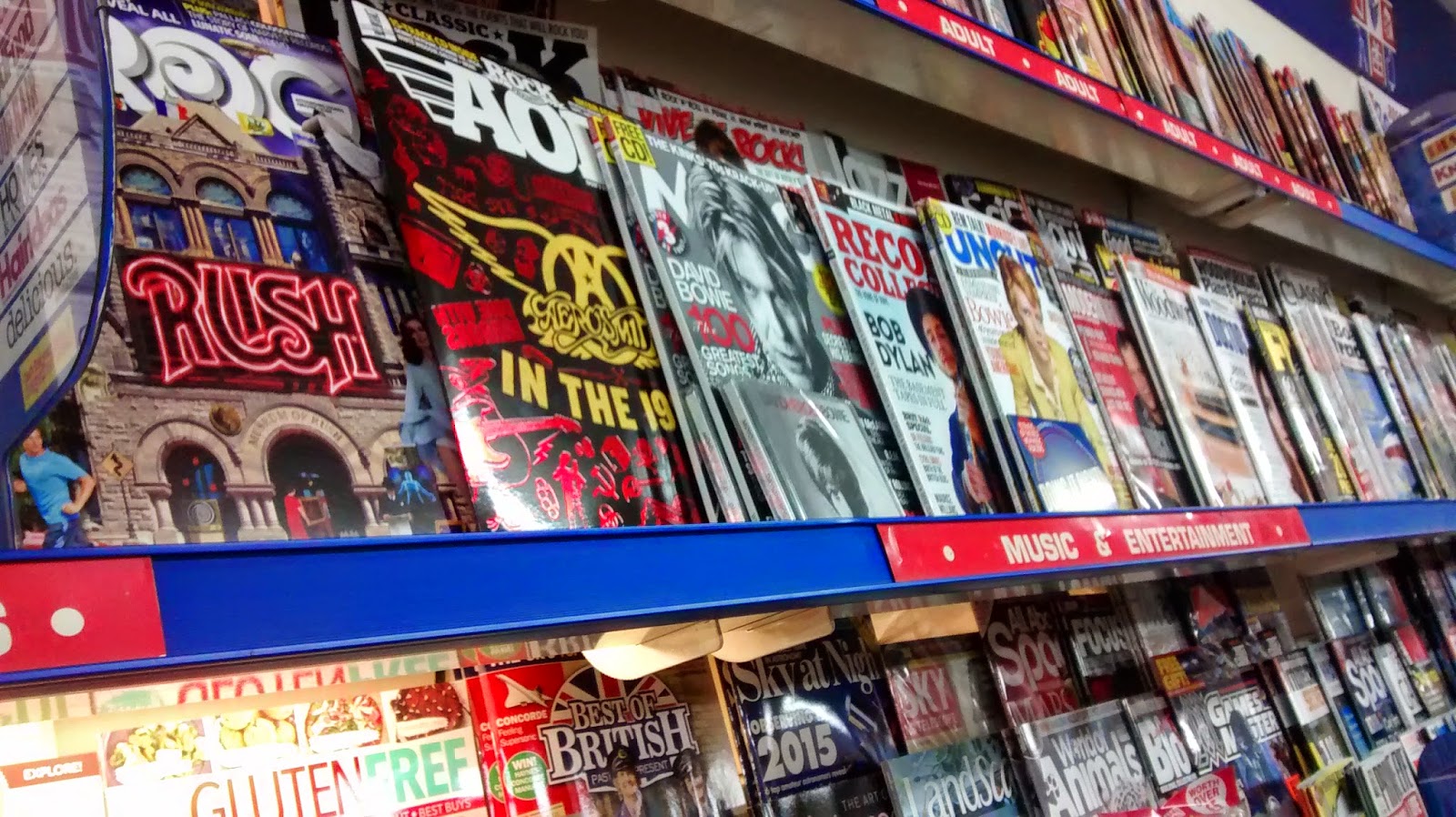
 On the other hand Bauer media are Europe's largest privately owned publishing company and is a worldwide media empire. They are responsible for publishing Kerrang magazine which once again is a magazine that's a lot like mine and since that magazine has had so much success in this institution I'd like to this that mine be successful to. Bauer are also responsible for a lot more well known brands as I realised from my research as I knew a lot more of them, some examples are 4 Music and Q magazine. Bauer are also largely associated with radio and TV, this can help with advertising as it can get out to a much larger audience.
 Since my magazine was aimed at the rock genre I aimed to get a grey scale and dark colour scheme a long with bright reds and yellows, the reason I mainly used these colours is because I know that they're very popular with rock magazines and this is because they're contrasting and so therefore allow my magazine to stand out easier. Also there's proof that these colours work well because if you look at magazines such as Kerrang and NME you can see that they stand out clearly as the colours are very contrasting, both to the image and the background colour. This is key if you are wanting your magazine to stand out to your audiences in shops and stands.


 Whilst in the process of creating my contents page I noticed that I didn't have a fitting image and so I decided to get one of the main artist in the band 'Vince Cage'. The reason I did this is because it would only be fitting to use the main star since the magazine is centered around the band. Also doing this shots makes a creative place for viewers to find out where the interview page is as the photo will have a page number over it.