Thursday, 2 April 2015
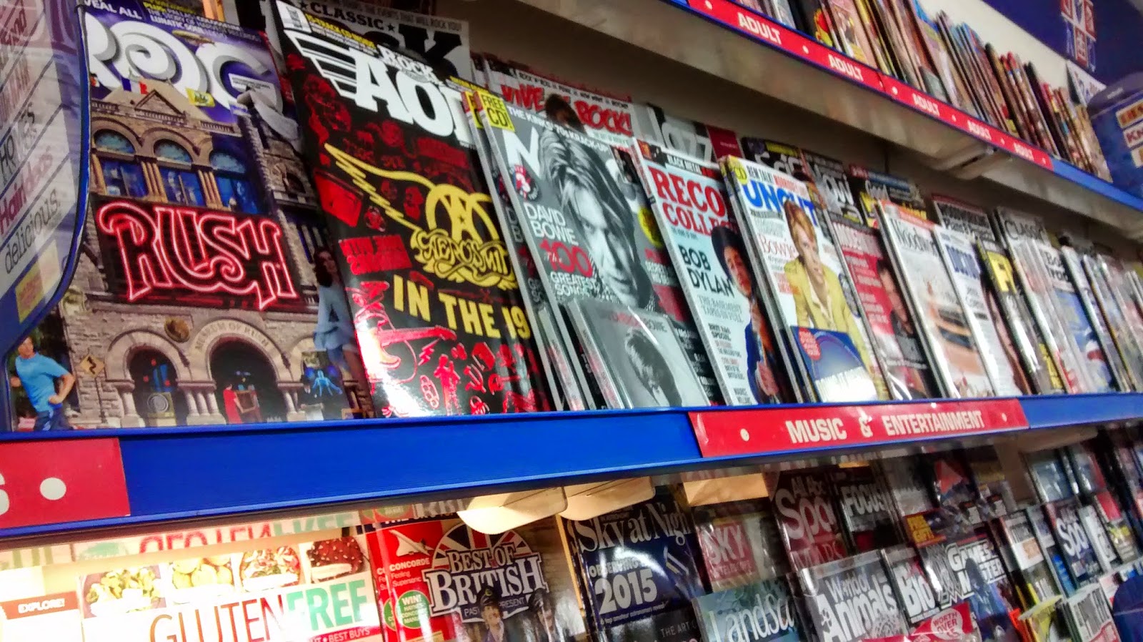
Photo of magazines in a shop
Taking this photo has helped with the planning with my magazine, this is because it has shown me that in order for my magazine to appeal to the audience on the shelf it'll have to have some bright colours which contrast with the background colour. For example in this photo the AOR Rock magazine has a black background but uses a shiny bright red and gold to stand out in comparison with the Mojo magazine next to it with a grey-scale colour scheme. However of course if all the other magazines were brightly coloured then the grey-scale magazine will stand out clearer. Also as you can see at the top of the image the Classic Rock magazine is hidden at the back, this means that it is key to make sure your magazine stands out to the audience.
Subscribe to:
Post Comments (Atom)

No comments:
Post a Comment