Thursday, 20 November 2014

Music Magazine Comparison


Institutions
  • ·      NME magazine is published by IPC Media, the UK’s biggest publisher of magazines and websites. NME was started in 1952 and was the top selling magazine during the 70’s.
  • ·      Kerrang magazine has 29 years of heritage and is currently the biggest music magazine in the world.

Target Audience
  • ·      NME magazine readers are usually 22-24 years old. 66% of readers are males and 34% are female, and 52% of it’s readers are full time workers. NME will usually feature a variety of more unheard bands to bring about some attention for them.
  • ·      Kerrang magazine has a fan base of a mean age of 22, with 45% of that being female and the other 55% being male. The magazine will typically include rock bands since the audience are usually listeners of rock music. 

Representation
  • ·      NME magazine goes for a dark background with bright text and colourful images, which contrasts clearly and makes the text and images stand out very well. They usually contain a quick main title so it shows that the magazine will be quick but will contain all the information, which is perfect for their target audience of workers.
  • ·      Kerrang magazine has gone for more of a duller approach as there’s a lot less bright colours. The main title is quick so that it’s fast to read and will attract younger people like their audience since they might not want to read through pages and pages about one thing. Although it’s quite an expensive magazine at £2.20, they usually include a variety of free gifts to make up for it.

Tuesday, 18 November 2014

Contents Page Analysis

Contents Page Analysis 1


 The use of red and black is a usual connotation of the Rolling Stones magazine as red and black is featured in their logo. As long as this they have used the typical conventions of a contents page, including a title, page numbers, pictures etc.


The titles are in bold to make them stand out and provide a bit of information to the reader. The font styles are consistent showing that the target audience may be quite mature as they want to appear professional. The page numbers on the pictures make the reader want to read those pages.

The pictures of famous celebrities including Barack Obama and Bruno Mars will make people interested as to why they’re there and want to read on. 


Contents Page Analysis 2

Red is a usual coulor of the Q magazine along with the standard white "Q" logo, this makes it look professional which will mean it may appeal to an older audience. The month and year is at the top which means it's a monthly magazine and will be reliable for readers.

They include famous artists names on the headings of the contents, this will attract different fans to read through. The font used for the headings is a different colour and is bolder compared to the rest of the text, this makes it stand out so that they're eye catching.

They use a variety of images on the page, including a main image of the Arctic Monkeys lead singer overlapping the word contents which makes him seem to have a higher status. They use colourful images to make them stand out clearly on the page compared to the white background.


Contents Page Analysis 3

Straight away the title shows to the readers that the magazine is going to be reliable since it says "NME This Week". They also use a black background on this part with white and red text, this makes it stand out clearly to the audience. 

They only include one main image on their contents page including a large main story in a contrasting text colour to show up clearer. They also include a special offer at the bottom stating you "Save over £45" in bold, bright yellow font. This is done to make the reader feel that they could save money that way and so may make them want to. 

The colours of the page are mostly black, white and red, this makes the red stand out clearer than the other colours. The other reason they've used red is because it's a typical colour of NME magazine and they want to keep their magazines consistent. 

Wednesday, 12 November 2014

Front Page Analysis

Front Page Analysis 1


The main cover title on this magazine cover is in bold, white text with a black outline to stand out compared to the background and the main image. This entices the reader to pick up the magazine as since it says he “speaks”, it makes it sound as if he’s telling secrets that people may want to read.


The main image is of Eddie Murphy as it connects with the cover title, this is clever as they have photographed him with his mouth covered when it says “speaks”. This image will make the reader become suspicious as to whether he’s done something bad in his past so they’ll be more likely to pick up the magazine and read it.

The cover titles on the side are all black which contrasts with the background colour of white since it makes them stand out clearly. Also all the main words are in bold so that people can read them easier and maybe want to read more if they see a name of a band they like.

Front Page Analysis 2

The main cover title on this magazine cover says “Coldplay” in bold, white text which overlays the picture of the Coldplay lead singer Chris Martin, this will attract fans of the band to buy the magazine. It also says “Barking!” underneath it, which suggests he’s barking since his mouth is stretched open as if he was shouting.

The main image of Chris Martin is a close up camera angle, which is a typical convention in magazines. Also it’s the main part of the cover since it attracts the most attention from fans rather than just saying “Coldplay”, they do this purposely to attract their audience.

The white and black colours used contrast well with the background colours; this is so that the font stands out. Also the red used on the logo is a very bold colour compared to the dull colour scheme used. Also the red is used at the top of the magazine to highlight the word “Glastonbury” which will interest music fans to read the magazine and see the “8 page special”.

Front Page Analysis 3

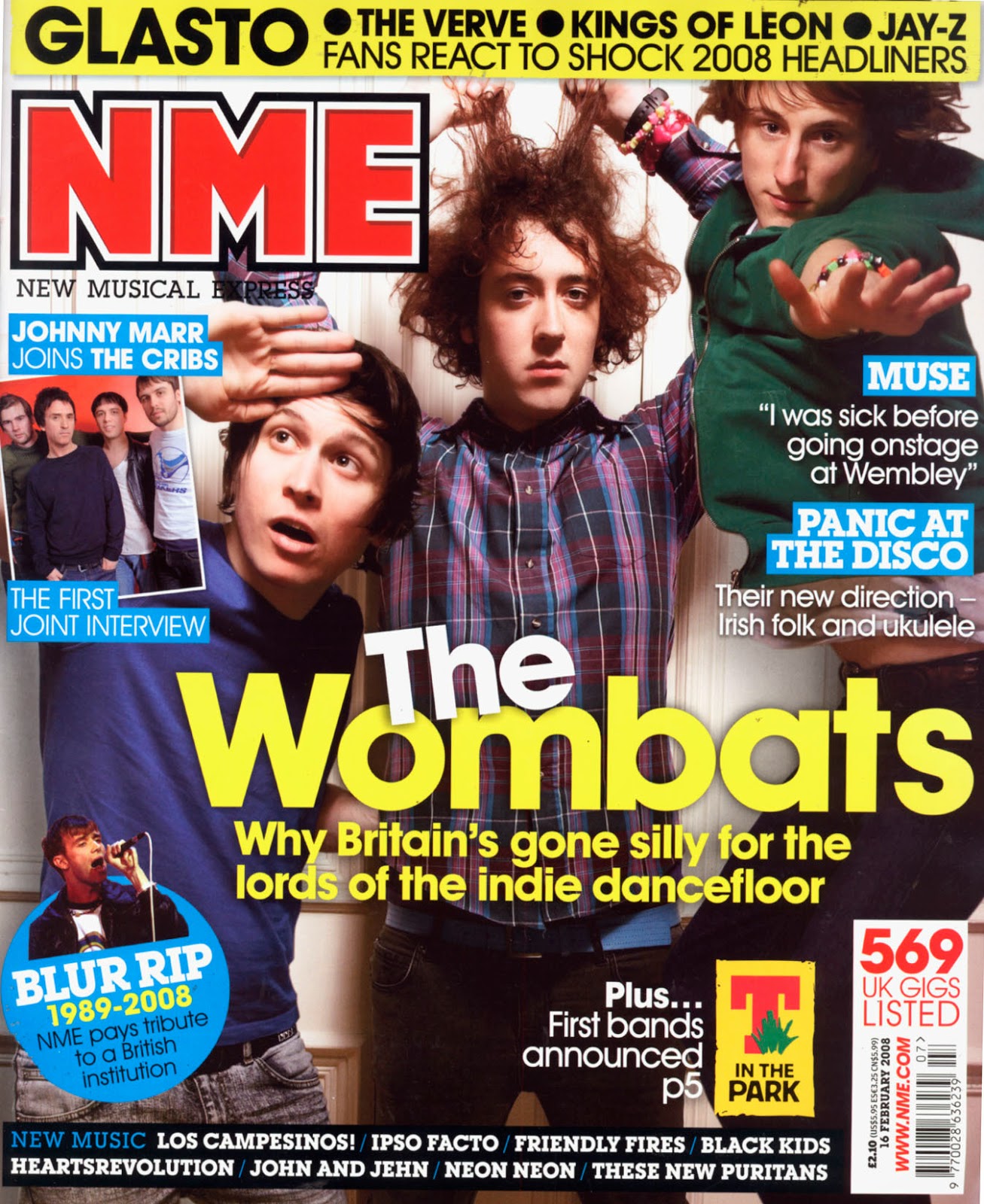
The main cover title on this magazine cover is bold, white and yellow text, which is very vibrant so it attracts attention from shoppers who walk past if it’s around duller coloured magazines. Also the NME title is the usual bright red that is very bold compared to the rest of the cover.

The main image of The Wombats is used to attract fans of them, as they’re the center of attention on the cover. There are a lot of different font styles and sizes, which is a usual convention as it draws the attention of the audience. There’s also a use of other pictures of other artists showing that it’s a music magazine.

There are a variety of colours used that may suggest that the magazine appeals to a younger audience. They also include a list of other famous artist at the top of the cover in black on a yellow background which is eye catching as it contrasts and therefore attracts more fans if they catch the name on the front. They’ve used a blue sticker in the bottom left in order to draw attention to the feature story.