Timeline of Rolling Stone magazine
1960’s
In the magazine you can see
that the colour is black and white since magazines and newspapers couldn’t be
printed in colour. There’s a main image of John Lennon, who was big celebrity
at the time to entice their audience to read the magazine. There’s a date,
issue number and price in the top right, which fits in with the usual
conventions so that it looks like a magazine.
1970’s
As you can see in this
magazine, there’s bright colour, which entices their audience into looking at
their magazine since at this time, printing in colour was the new thing. The
font is a lot less clumped together which means that the text stands out a lot
more. They’re wearing bright coloured clothes, which is very typical of the
70’s. There’s a slogan at the top of the page, which is in white to contrast
with the dark background.
1980’s
The
colours in this magazine are a lot bolder. Also the white background makes a
good contrast with the black leather jacket, this will make the photo stand out
to the buyers. The font stands out a lot to the audience as there’s a contrast
with the background colour and the text colour. Also there’s a bar code in the
bottom left, which is a typical convention of a magazine.
1990’s
For this issue, they chose
to match the colour scheme with the suits, this automatically makes any other
colour stand out, and so the use of multiple colours in the bottom right works
well as they stand out. The photograph makes the band look cool to the audience
by the use of their facial expressions and their clothes. There’s a barcode in
the bottom left which is a convention of magazines.
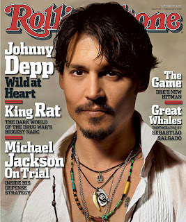
2000’s
This issue has a light brown
background, which contrasts with the shirt that is being worn; this makes the
image stand out to the audience. Also the use of white on the text is very loud
so you can read the headlines easily and so that they stand out. There’s an
issue number in the top right hand corner, which is a typical convention of a
magazine.


No comments:
Post a Comment